Reworked Belts
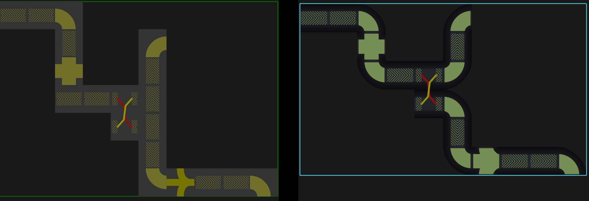
I spent some time reworking all belt-like Structures. All of the belt-like graphical assets have been updated. You’ll also notice that the different Structures now fuse much more nicely.
Belt corners are now also active when other belt-like Structures are connected to Belts (instead of just for Belt - Belt connections).
Below an image showing the new belt improvements (OLD | NEW):
Reworked Arms
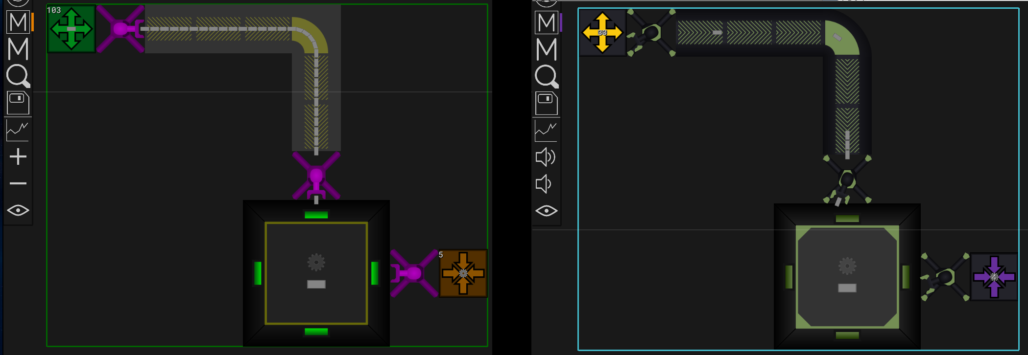
With this release Arms are reworked entirely. I didn’t like how Arms were the only Structure where the ‘tier color’ affected the entire texture. This caused for example green Arms to be barely visible on grass.
I therefore reworked their graphical assets to have ‘tier indicators’ instead.
In addition to the graphical changes I also decided to greatly reduce the speed of Arms, and added easing to their animation. There’s also many more tiers of Arms now.
Below an image comparing OLD | NEW:

Reworked Assemblers
Assemblers now have much larger ‘tier indicators’. Their light now also shines in the respective tier’s color, making it easier to tell them apart. I also slightly changed their background color to generally increase contrast to their recipe.
Below an image showing the changes (OLD | NEW):

Usage Of Color Palettes
Previously Factor Y used ‘random’ colors for its Structures, Items and UI elements.
This has now changed and for the most part only colors from two color palettes are used.
One is used for the tier / Mk indicator of Structures, the other for colors in general.
Below an image showing the new color palette usage (OLD | NEW):
Many More Structure Tiers
Previously I had individual graphical assets for all the different tiers of Items and Structures.
For example: Belt, BeltCornerLeft, BeltCornerRight, FastBelt, FastBeltCornerLeft, …
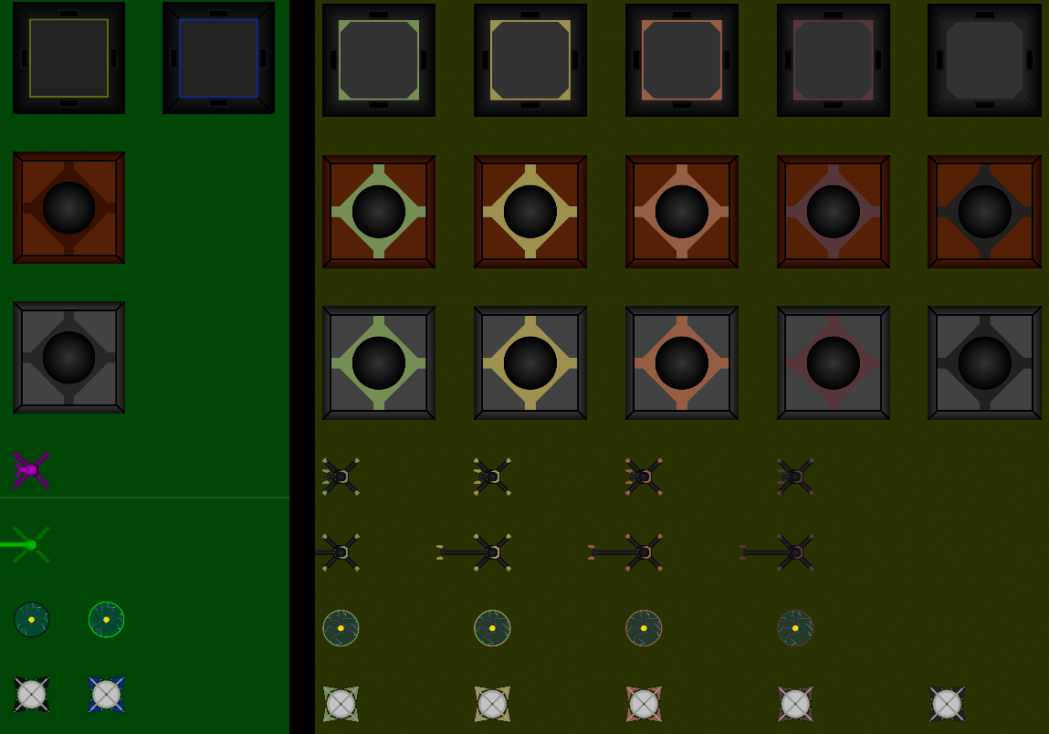
I finally created an automated process to generate different tiers of assets and can now simply define that there should be for example 5 tiers of Assemblers, causing all the assets to be generated automatically with the matching tier indicator.
Since this now makes it trivial to have multiple tiers, I went ahead and added many more.
I also changed the naming convention for Items, Structures and technologies to use an MkN suffix.
Belt -> Belt Mk1, FastBelt -> Belt Mk2 etc.
Below an image showing the new tiers of Structures (OLD | NEW):
Info Box Improvements
This release greatly improves the Info Box.
I implemented support for multi-colored text which is now used heavily for the Info Box.
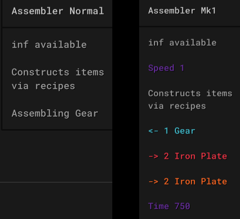
The shown text has been compressed to save space and generally much more information is now shown in the Info Box.
Below as an example the Info Box when hovering an Assembler crafting Gears (OLD | NEW):
(Note that the orange line displays the raw material cost which is the same as the input in case of Gear)
Reworked Planet Visuals
There have been several improvements to the visuals of planets within this release.
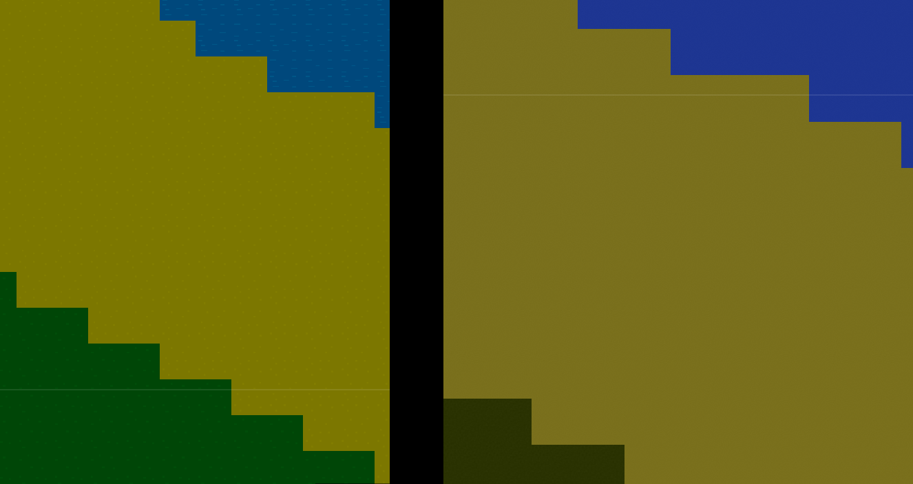
Updated Tiles
All planet tiles have been reworked and are now less colorful while using smoother noise.
Below an image showing the new tiles (OLD | NEW):
Round Planets
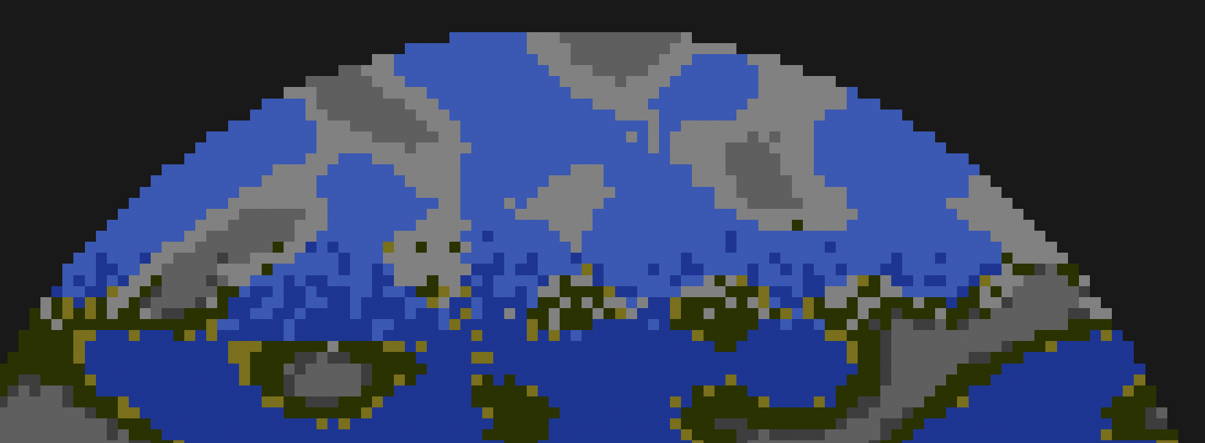
Previously planets were only shown as round in the space view. Now they are actually round.
Smoother Temperature Transition
I improved the way a planet’s temperature is calculated. This now yields way smoother transitions between for example ice and water tiles.
Below an image showing both the round planets and smoother temperature transition:
Rougher Tile Quality
To improve performance the renderer now switches to a rougher tile quality more early.
It’s implemented in such a way that the change should be barely noticable while cutting the number of rendered tiles roughly in half.
Other Asset Changes
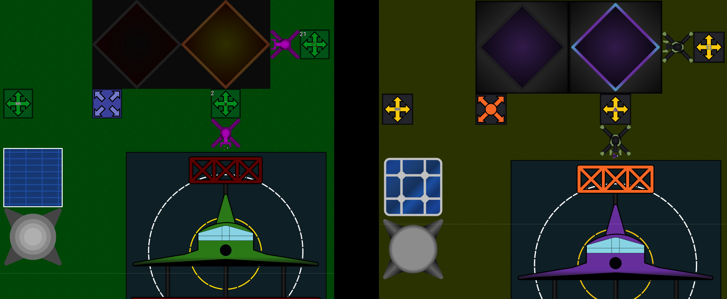
In addition to the Arm, Assembler and Belt changes, I also updated some of the other assets.
Below an image comparing OLD | NEW:
Improvements To Modules
This release brings another batch of improvements to the Module system.
Deleting / Hiding Modules
It’s now possible to delete Modules from the Module View either by using the Delete key, or using the Remove cursor.
Note that they are just hidden from the view since they may still be referenced by other Modules or actually be placed on one of your planets. Due to that you may run into ‘name in use’ issues without seeing a Module of such name in the view.
Source / Sink Item Count
The item count of Sources and Sinks is now also shown in the Module View.
Activity Indicator
Previously a Module’s activity indicator was rendered above its content. This is not the case anymore and should improve readability.
Deletion Of Selected
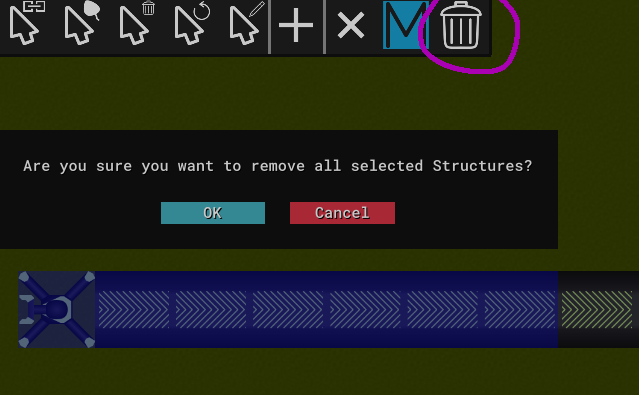
On planets it’s now possible to remove selected Structures. I also added a confirmation dialog to prevent you from accidentally deleting your factory.
Performance Improvements
I greatly improved the performance of user interactions.
Adding new Structures at the edge of your factory is now way faster.
Due to the new ‘selection delete’ I also had to improve the remove performance. For the single removal case it’s roughly 10 times faster than before. There’s also additional optimizations if one removes many Structures at once.
General UI Improvements
Reduced Font Size
With the recent switch to a new font the font size was also greatly increased.
This time I slighlty reduced the font size to have some more space for text.
New, Dedicated Volume Buttons
For changing the volume simple + and - buttons were used. This release adds new, dedicated volume buttons.

Removed UI Transparency
I removed basically all UI transparency. It was hurting readability especially if there was other text rendered below overlays that also showed text.
Single Configuration File
Before 0.2 there was only one configuration file combine_and_conquer.toml which was read on startup and had to be edited by hand.
0.2 introduced combine_and_conquer_user_cfg.toml that was managed by the game and was for example storing your render toggles.
I merged the two into a single configuration file that’s entirely managed by the game.
More Overlay Columns
The Overlay is now rendered with 4 item columns instead of the previous 3. This release added a lot more Items and Structures and made that change necessary to save some space.
I also slightly changed the Overlay‘s color to increase contrast.
Savegames
Savegame files now have a versioned file ending. Factor Y will now only show games with the matching ending.
This way you won’t see games listed that would fail to load anyway.
Balancing
There have been many changes to costs of technologies and recipes.
Some recipes and for example Furnaces were slowed down to be more in sync with the new Arm speed.
Higher tiers of Structures now each roughly require 4 times the power of the previous tier instead of the former 2.
Solar has been nerfed and requires a technology unlock while Burner Power was buffed.
There have also been many more, minor changes to recipes and research costs.
Billboard Rendering Of Cooldown
All cooldowns are now rendered as billboards, ignoring any rotation.
New Sounds
Warning and error notification messages now also play sounds to make them more noticable.
Other, Minor Improvements
This release also contains many, minor improvements:
-
The visibility of
ResearchTokens is now improved - Improved render quality of the Energy UI’s border
- Now clearing the selection when creating a Blueprint from selected
- Removed the borders from non-active planets
-
The
Edit Modulecursor can now also be used from within the Module View and Planner - Instead of either showing all or none of the cursor buttons, only the ones usable in the current view are shown
-
The logo of
Factor Ywas updated - The logo in the top left corner now properly scales with the hotbars in case of a small window
- ‘Right-Drag-Place’ now activates later to avoid accidental usage
-
Text on
SourceandSinkis now centered -
ArmItems are now correctly rendered above Modules -
Research progress lines (
RT1 500 / 2000…) are now aligned at the/ -
If there are
Labs present and further research possible but none active a warning will be shown periodically - No sounds are played on drag place if the inventory is empty
-
Show total
Structurecount as part of statistics - Disallow empty names for savegames
- The ‘selection to Blueprint’ button now uses the updated Module icon
- Don’t play any sounds if the planner is currently stopped
- Show an error if loading fails
- Close the tech tree after starting a research
- More helpful error messages in case the Module generation fails
Bugfixes
There have been several bugfixes in this release.
Connecting rotated Structures that have asymmetrical shapes could fail in previous versions. In that case the affected Structures would not interact with each other. This is now fixed.
Previously there have been cases where a Structure‘s activity indicatior did not match its actual state. This is now fixed for Labs, Assemblers and Furnaces. I’m not aware of any more broken cases. If you find some, please let me know.
Items on Crossings are now correctly rotated.