While version 0.4.2 contains quite many changes, none affect savegames.
0.4.2 works with savegames of the previous 0.4 versions.
Note that due to some of the changes existing hotkeys were changed.
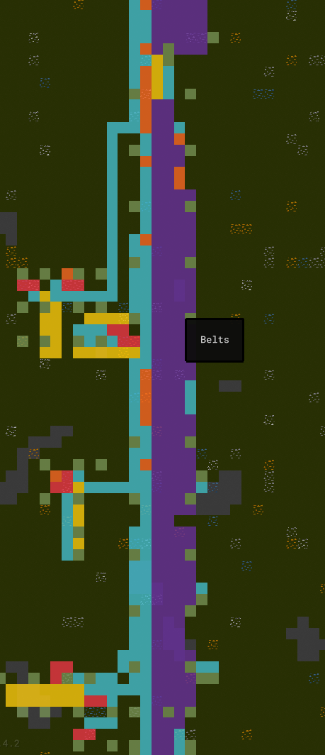
Colored Presence
The ‘presence’ is now colored depending on the Structures’ categories.
The category is also shown in the InfoBox on hover.
InfoBox
This release comes with major improvements to the InfoBox.
Follow The Cursor
The InfoBox now follows your cursor instead of being fixed in the top-right corner.
Its behavior will avoid blocking your cursor and the window’s edges. It’s now also rendered above everything else. This has some major benefits:
-
Thanks to the allowed overlap, it now uses less space since it doesn’t have to share vertical space with the
Overlayanymore - It being closer to the cursor should make it more pleasent to look at information of the hovered item since you won’t have to look across the screen anymore
Since you might not want to have it blocking your view it is now also hidden by default.
It’ll fade in once you keep your cursor still for a little while. It will disappear again if you move your cursor ‘a lot’. This way it’s possible to still scan multiple elements without it disappearing immediately.
More Information
This release now shows more information in the InfoBox:
-
I added description texts to all the
Hotbarbuttons -
The current cooldown of hovered
Structures is now shown -
The active flights for
LaunchPadandLanding Zoneare now listed -
The link state for
LaunchPadandLanding Zoneis now visible (but only with ‘planet precision’) -
LabandBurner Powercooldowns are now shown
Other Improvements
There’s also general improvements to the InfoBox:
-
I changed the ‘holding’ text of
Arms to be less distracting - I improved the text formatting in general
-
Showing information when zoomed out now considers the actually visible tile instead of what’s ‘below the cursor’ at the exact position. This was e.g. noticable when hovering ore patches from far away, where the displayed ore in the
InfoBoxmight not have matched what you see below the cursor. -
I renamed
Current Energy StatstoEnergy
Savegames
This release includes some more improvements regarding savegames.
InfoBox Support
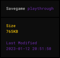
The InfoBox now works for the savegame view and shows additional information about a game.
Savegame Size
The size of a savegame is now known and shown in the InfoBox.
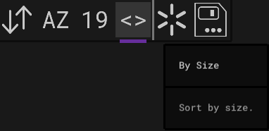
There’s now also a new option to sort games by size. This makes it easy to spot your biggest factories.
Render Performance
I greatly improved the render performance of the savegame view. Previously all texts were rendered, now only the visible ones. I also improved the performance of the ‘mouse hover check’. Even with roughly 500 games and a debug build I encounter 0 delay now.
Other
I added some missing notifications for the start of the save operation. (for example: ‘Saving NAME as…’)
UI Improvements
This release includes several UI improvements.
Dynamic Positioning
In previous versions some of the UI elements were still positioned ‘by hand’.
This solution wasn’t perfect and on change I had to tweak some values to make sure everything is correctly positioned.
This now happens automatically.
You’ll also notice that some elements now slightly moved due to that change. For example the notifications will now be displayed ‘at the top’ if there’s no confirmation dialog or text edit active.
Small Screen Support
I improved the automatic UI resizing some more to even better support smaller screens.
In combination with the now floating InfoBox this allows for really small window sizes.
Text Edit + Confirmation Dialog
Previously it was possible to have both active and overlapping, having a pretty undefined state.
This is not possible anymore. Only one of the two will ever be active now.
Other
I also noticed that the ‘version string’ wasn’t correctly positioned in all cases. This should now be the case.
In this release the font size was also slightly reduced.
Notification Grouping
Equal notifications are now grouped, showing a counter suffix instead. This greatly reduces spam caused by notifications.

Low-Res Belts
Previously when zoomed out rather far the Belt stripes caused unpleasent flickering effects due to aliasing.
In this version I introduced a new ‘low-res’ version of the Belts which is used when zoomed out.
Rotate Improvements
There have been several improvements regarding rotation in this release.
Rotate Selected
It’s now possible to rotate the selected Structures. This is limited to symmetrical Structures since for asymmetrical ones a multi-rotate could cause them to block each other and the result would depend on the order in which the Structures are rotated. One could also end up in a state that can’t be undone.

Reverse Rotate
You can now ‘reverse rotate’ via Shift+R.
Updated Icons
I updated the rotation icons since I noticed that while the rotation is clockwise, the icons were counter-clockwise.
Research UI Improvements
I introduced another color for the research progress to make it more clear whether a technology is fully researched or only for example 99%.
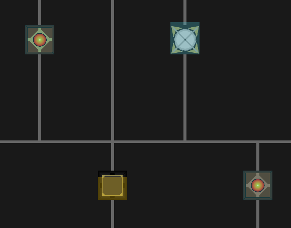
The research progress shown in the InfoBox is now also colorized.
Screenshot Mode
It’s now possible to hide the UI by pressing Shift+J. This can be aborted by pressing ESC.
Faster Camera Move
You can now hold Shift while using WASD or the arrow keys to move around even faster.
Better Upgrade Behavior
When upgrading or replacing Structures there’s now two cases regarding the rotation-choice:
-
If it’s the same
Structurebut just another ‘mode’ (Belt Mk1->Belt Mk2,Arm Mk1->Long Arm Mk1) the original orientation is used -
If its another
Structurebut an upgrade is allowed (Belt Mk1->Splitter) the cursor orientation is used
Show Current Planet
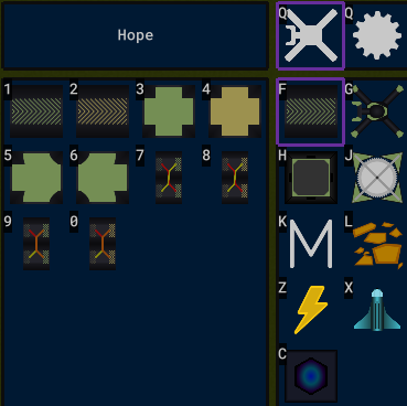
I added an indicator to the Overlay to show the currently active / focused planet. This way it becomes clearer which planet is considered for the Structure counts.
Flights
Previously flights were hidden once the player zoomed in far enough. This is now only the case if a planet is also in focus.
I also fixed some cases where the InfoBox wouldn’t show information on a flight.
Guide Improvements
This release brings several improvements to the guide. It was improved in general, got a new section regarding the InfoBox and describes the new selection features.
Other, Minor Improvements
- Disable the water sound when zoomed out far
- Remove the ‘you have labs but no research running’ notification
- Only show ‘R to rotate’ if the cursor structure is rotatable
- Fix the in some cases broken cursor hover events in the bottom left corner
-
You can now switch between item and structure mode with just
Q - The hover effect for hotbars is now more noticable
-
When starting a new game with the ‘Starter cursor’ the
Overlaynow also has that selected -
The ‘base’ texture of
Arms has been flipped, since it looked like it ‘pointed’ in the wrong direction -
Add keyboard controls to the
Confirmation Dialog(Ok:Enter, Cancel:ESC) -
Pressing
Delwith a selection active now triggers the ‘remove selected’ action -
The
Energycategory now has a new icon - When setting ‘Modularize Ticks’ the text input will now also show the current value
-
Add shortcut
Ufor picking the ‘set source limit’ cursor - The logic for ‘running low on power’ is now implemented for all planets individually and will show even if no planet is focused
-
Hide the
SourceandSinkcounts when zoomed out far -
Guard the ‘colonize’ action via
Confirmation Dialog -
Allow running
Factor Ywithout any audio (for debugging) -
Allow usage of
-for names / in text inputs -
Labs were showingResearch Tokens asT1,T2, … . This is changed toRT1,RT2, … to match other occurences - I once more updated the coal texture to increase the contrast especially against belts