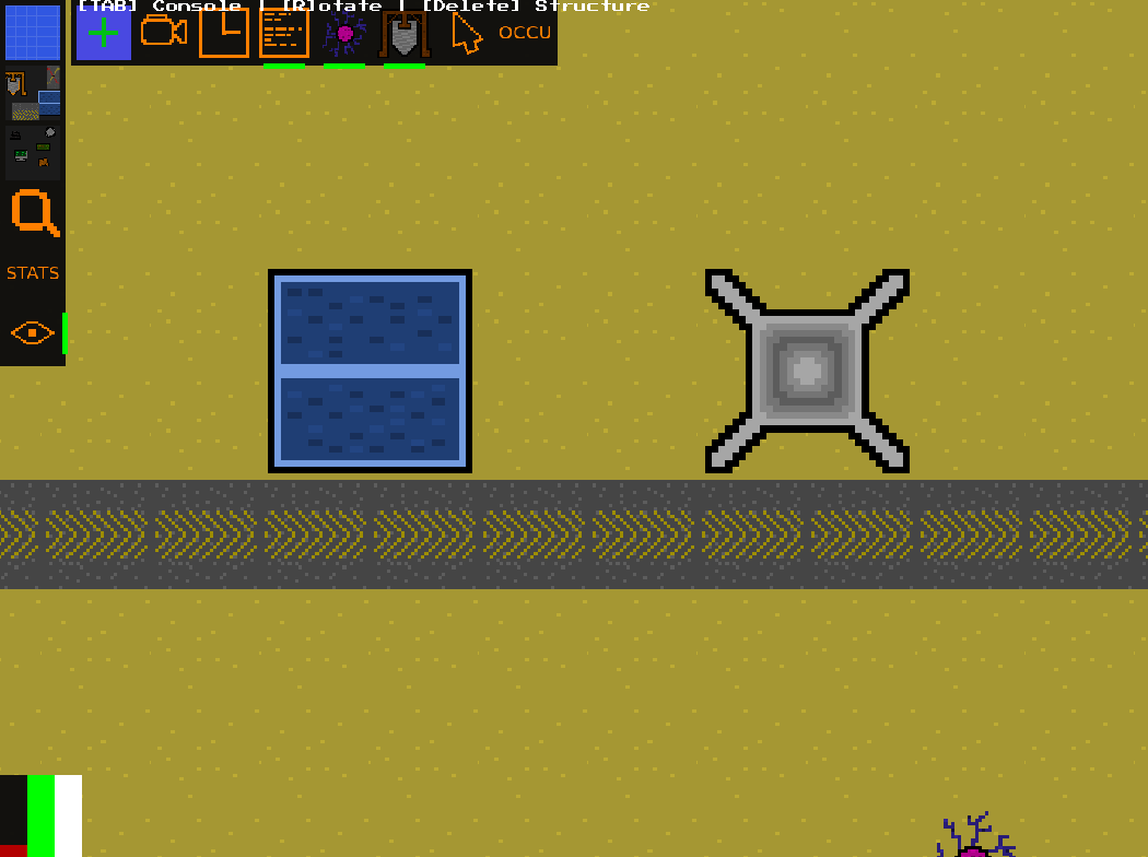
I applied multiple improvements to the UI.
New ground tile
I changed the default Ground tile to be green. This looks nicer and increases contrast since some Structures are brown.
Second hotbar
There’s now a second, horizontal Hotbar with additional buttons. Previously the primary hotbar showed all buttons, but that became too chaotic and used a lot of vertical space. I also changed the color of icons to increase the contrast.
UI for energy
I added a UI for Energy production and storage (bottom left of below image).
The first vertical bar shows the Energy consumption, the second the production and the third the currently stored Energy vs the storage capacity.
The production bar turns more and more red once consumption is larger than production.
