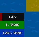
I spent the last few days improving the text rendering.
Text render node for world space
Until now every TextNode was defined via a position and size, both in screen space via pixel values.
Initially this worked well for showing text ‘on top’ of the game for example for notifications.
But now text is used basically everywhere to display additional information. This forced me to calculate the proper screen coordinates wherever text was used and I couldn’t just multiply e.g. the parent’s model matrix with the current one.
For this I renamed TextNode to TextNodeScreen and introduced a new TextNodeWorld:
pub struct TextNodeScreen {
    pub scale_factor: f64,
    pub position: Pos<Screen<f64>>,
    pub size: Size<Screen<f64>>,
    pub text: CowStr,
    pub center_horizontally: bool,
    pub center_vertically: bool,
}
...
pub struct TextNodeWorld {
    pub scale_factor: f64,
    pub depth: Option<Depth>,
    pub transformation: Option<Matrix4>,
    pub size: Size<f64>,
    pub text: CowStr,
    pub center_horizontally: bool,
    pub center_vertically: bool,
    pub min_render_size: Option<Screen<f64>>,
}
In addition to that, the new node now also supports:
Custom depth for text
It’s now possible to render text via TextNodeWorld at a specific Depth (z-coordinate). Previously all text was rendered with the same Depth value, which made it impossible to hide it behind other UI elements.
I for example had to prevent rendering of any Planet text once an overlay was active. Such text is now correctly hidden behind overlays.
Min render size for text
With the new TextNodeWorld it’s now also possible to specify a minimum render size. If the text node is smaller than that after all transformations, it won’t be rendered.
This makes it possible to e.g. automatically hide text overlays of Assemblers once they become small due to zooming out.
Readability improvements
I improved the readability of text by increasing its sharpness and adding a slight shadow to it.
Below ‘before’ then ‘after’:


Text on Power UI
Since it’s now more easy to use text, I added some to the Power UI and also added improved support for large numbers:
