Prototype to Early Access
This version finally contains all the features I consider necessary for this type of game.
Therefore Factor Y is now leaving the prototype stage and moving forward to Early Access :) .
Savegame Management
The last missing piece for leaving the prototype stage was proper savegame management.
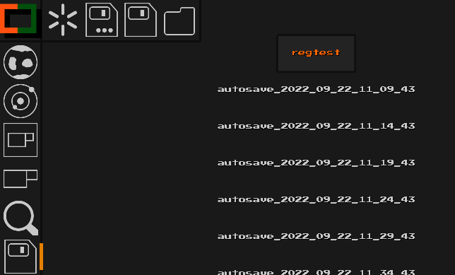
This version introduces a new view for managing your savegames that can be accessed from the hotbar.
From this view you can:
- Start a new game
- Load other savegames
- Overwrite savegames with your current game
- Save your game under a new name
Below the new hotbar button for the savegame view and the view itself:

Note that Factor Y now always starts with a new game. Use the savegame view to load the game you want to play.
Thanks to those changes and since I was already working on these parts of the codebase, there have been additional improvements:
Multiple autosaves
Previously there was just one autosave file written while playing. Due to that it was rather easy to accidentally overwrite previous games.
From now on autosave files will have both the current date and time in their name, preventing accidentaly overwrites. For example:
autosave_2022_09_22_11_09_43.binSave on …
There’s now an additional autosave happening whenever you ‘normally’ exit Factor Y, further preventing data loss.
Using the new New Game and Load functions will also trigger autosaves to prevent data loss in case you haven’t saved before.
Simplified .toml file
Settings regarding savegames and the client have been removed from the configuration file, since this is now handled via the new view.
Render Quality
I improved the render pipeline to allow for a better render quality.
Thanks to the changes done for this, GPUs with smaller texture size support can now be used, while also allowing for more game textures/icons or a higher texture resolution in the future.
Below the before [left] and after [right]:

Planner and Blueprint improvements
I applied several improvements to the planner and blueprints in general.
Support for multiple Blueprints within the Planner
Previously one could only edit a single blueprint from within the planner.
This caused many functions to delete the player’s previous work.
With this release the planner can now be used to edit any number of blueprints. Functions that create a new blueprint (e.g. Edit Module) now simply add a new one to the planner instead of causing overwrites.
For this, new buttons were added to the planner:
-
Previous / Next Blueprint=> Open the previous or next blueprint -
New Blueprint=> Plan a new blueprint -
Remove Blueprint=> Removes the current blueprint from the planner (previouslyClear Blueprint)
The planner’s text now also indicates which of the blueprints is being edited.
Below an image of the new buttons and the currently selected blueprint (Blueprint 1/1)

New stop condition
There’s now the new stop condition Stop When All Sinks Have Items. While active, the planner will stop the simulation once any Sinks are present and all of them have items in them.
This makes it pretty easy to find the proper tick count for when the module would first produce all the wanted items.
The Stop At Max Ticks icon was reworked to be able to tell the two apart.

Improvements to ‘Blueprint from Selection’
This release improves the ‘creating blueprints from selection’ workflow.
Previously if there were any Structures selected that aren’t allowed within the planner (e.g. Miners), Create Blueprint From Selection would have failed.
With this version, unsupported Structures are simply not copied to the planner and a warning is issued when this happens.
Also the blueprint is now centered better within the planner.
Module Name
Previously there was a dedicated button to set the Modules name. Having a name was required for using Modularize Blueprint.
This was quite annoying to use.
Now, Modularize Blueprint will prompt you for a name instead, removing the need for the extra step and button.
Restart on Edit Icon
I reworked the Restart on Edit icon to improve its clarity.

Overlay Improvements
There have been some quality of life changes for the Overlay:
- When switching category, the first object of that category is auto-selected
-
When switching between
ItemandStructuremode, the equivalent is selected if available. (e.g. having theBeltStructureselected, will cause a selection of theBeltItem/ recipe on mode switch)
This way less player interaction is required when using the Overlay.
Decreased Offline Mode CPU Usage
Due to how Factor Y‘s singleplayer was implemented, the simulation was running twice.
Once for the actual ‘client’ game you’re using and once for a ‘fake server’.
This was now reworked and the ‘fake server’ doesn’t have to run a full simulation anymore, cutting total CPU usage for the simulation in half.
Rendering Without Rotation
Factor Y now supports rendering of objects while ignoring their rotation.
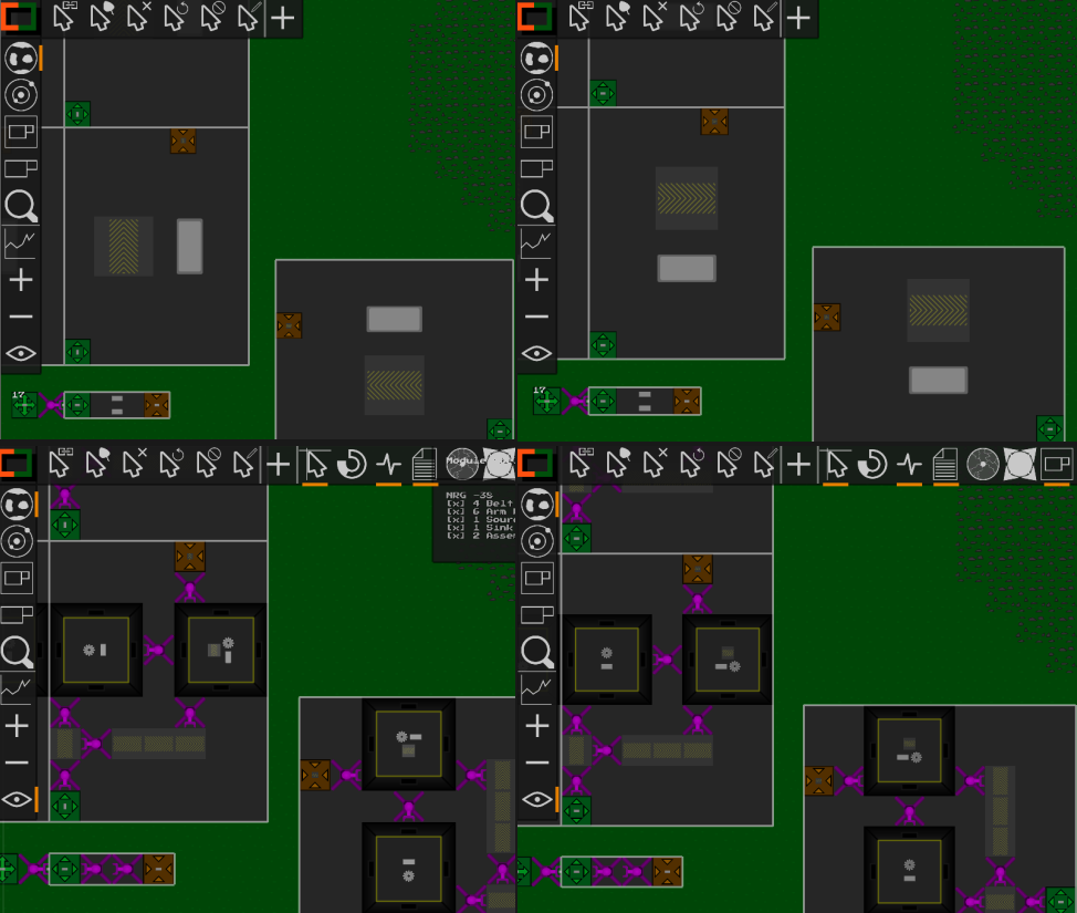
This is for example used for recipes of Modules and Assemblers. Previously a rotated Module or Assembler would also have its recipe rotated, reducing clarity.
Below an example of the before [left] and after [right]:

Sound improvements
There have been some improvements to the sound engine and new sounds were added:
- Most sounds now only play when an action actually happened
- Sounds are now also played when switching views via the keyboard shortcuts
-
Add a sound for the rotation of
Structures orModules -
Add a sound for setting a recipe or a
Source‘sItem
Arm and Belt Interactions
Previously Arms weren’t allowed to grab Items from Crossing, Splitter, Merger etc.
This limitation is now gone and Arms should be able to grab Items from any ‘belt-like’ Structure.
Reworked Arm Textures
The Arm textures were the last remaining ones with outlines. I reworked them:

Other, Minor Improvements
There have also been other, minor improvements:
-
The
ModuleSource/Sinktext is now centered -
The
Cursorshotbar buttons aren’t always shown anymore -
The
InfoBoxnow shows more description text forStructures -
On/Offstates in theOverlayhave been unified (ItemandStructurewould previously mismatch in some cases) - The way recipes are rendered has been improved to increase clarity
- Improved the visibility of the hotbar divider
- Improved visibility and position of both text input and confirmation dialog
-
Renamed
Cursor: Space Port LinkingtoCursor: Space Cargo Linking -
The
Starteris now animated -
When selecting a
Modulethe previous view is shown automatically -
Improve readability of the the
Current Tech UIby avoiding text overflow and adding an overlay - Reorder hotbar buttons to have planner next to modules
-
Disallow upgrade/replace to exactly the same
Structure(this prevents loss ofItems when for example placing aBelton aBelt) -
Sort
Overlay‘s categories by expected usage frequency -
The
Startercan’t be used asProvideranymore -
Render arm of
Long Armon top of otherStructures to prevent clipping - Change the activity color (green to orange)
Bugfixes
There have also been several bugfixes:
-
Fix a rendering artifact of
Miner - Prevent overlap between confirmation dialog and notification log
-
Fix rendering of selected
Modules within theModulesview -
Improve the
Cursor Crossicon -
Fix incorrect aspect ratio when rendering
SwapperandMixerin some cases